When Google introduced changes to its mobile search algorithm, a TechCrunch survey found that 44 percent of Fortune 500 websites failed.
Mobile is More Important Than SEO
Mobile friendliness is beginning to outrank SEO in its importance. In April 2015, Google announced its new algorithm that would negatively affect Google rankings in mobile search for websites that are not mobile-friendly.
A good SEO strategy can help direct people’s searches to a website. But now, if a website has a low rank for mobile-friendliness it can get pushed down in search results, creating less traffic for a website. Once users actually visit a mobile site, it should be formatted properly and easy to navigate.
Remember the User Experience
The two things that matter most in optimizing an ecommerce website for mobile devices is its usability and loading time. According to Mobify, a mobile commerce and engagement platform, 30 percent of mobile shoppers will abandon a transaction if the experience is not designed for mobile devices. Fifty seven percent of customers say they will abandon a site if they have to wait three more than seconds for a page to load.
When Google introduced the changes to its mobile search algorithm, a TechCrunch survey found that 44 percent of Fortune 500 websites failed Google’s mobile-friendly test, with another four percent producing no response at all.
7 Great Mobile-Friendly E-commerce Websites
Here are ten examples of mobile friendly ecommerce websites. Each of them was tested on several smartphones and tablets.
1. Etsy
Etsy: This is an E-commerce website where anyone can buy and sell homemade or vintage items. Etsy’s mobile site configures nicely to both smartphones and tablets.
It provides a prominent search bar and a button to open their App, should you wish to do your shopping there. They also have implemented a popular grid format with photos that many mobile sites use to ensure the display is clean and simple to use.
Takeaway: Keep it simple. Piling too many pictures on the screen can be a huge distraction. Shoppers prefer a simple design that makes it very easy for them to quickly find what they are looking for.
2. Express
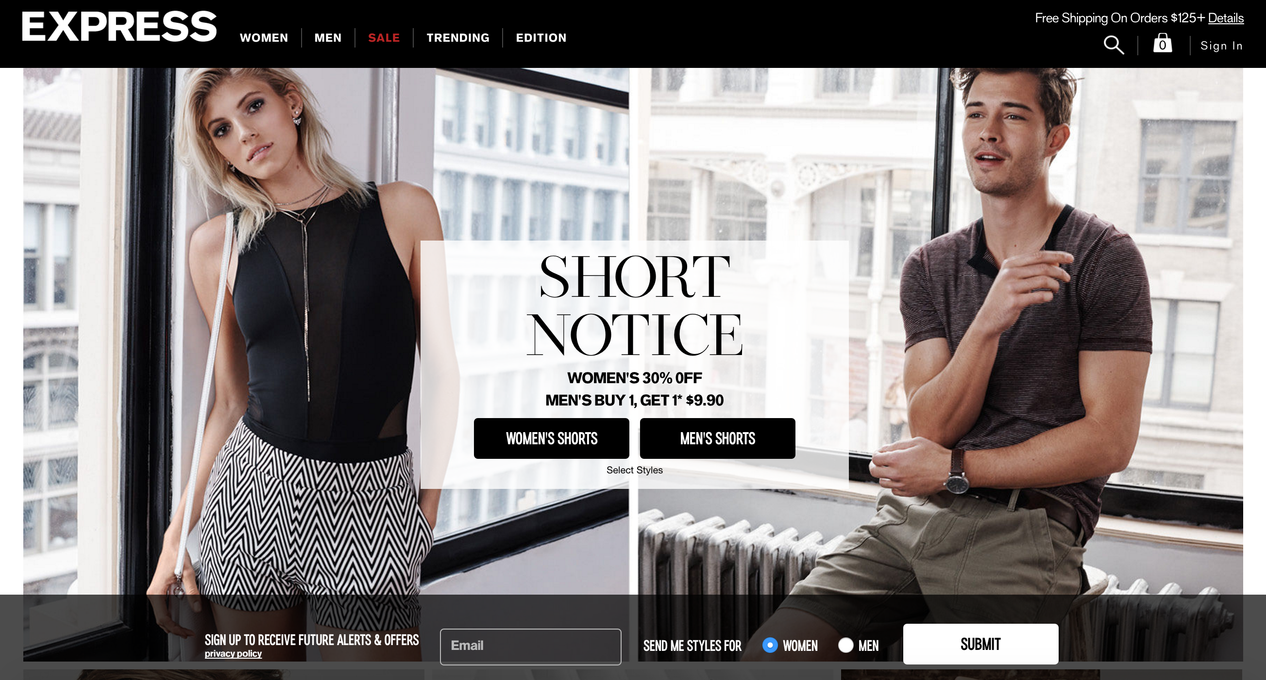
Express: This is a clothing store that caters to young men and women, and Express clearly knows its audience has come to their mobile site to browse. Their site has big, clear images of the items with prices and short descriptions below, eliminating the necessity to constantly click each image to find vital information.
An incredibly mobile-friendly aspect happens when a user slides their finger from left to right over a piece of clothing. The image changes, so you can see a different view of each piece without having to load a new page.

Takeaway: Shoppers want instant gratification. The less they have to click around to complete a purchase, the better. Also, providing as close to an in-person shopping experience as possible will help increase conversions. By allowing shoppers the ability to see multiple views of an item without the need to make extra clicks, Express greatly improves the user experience.
3. Nike
Nike: This well-known shoe retailer relies on stunning photos of their products, combined with concise copy, to lure in users. Their minimalist design puts the focus on the products and encourages engagement by users to click and scroll through large images. At the top there are three main icons, a search bar, shopping cart, and main drop-down menu to their category items.
Takeaway: Don't forget how important it is to use high quality images and create great copy to describe your products. Shoppers are busy. They have text messages coming in. They have their Facebook updates to check. They have Snapchat and Pinterest and Periscope and LinkedIn and. . . you get the point. You don't have a whole lot of time to grab a shopper's attention. Your graphics and copy should be on point.
4. Threadless
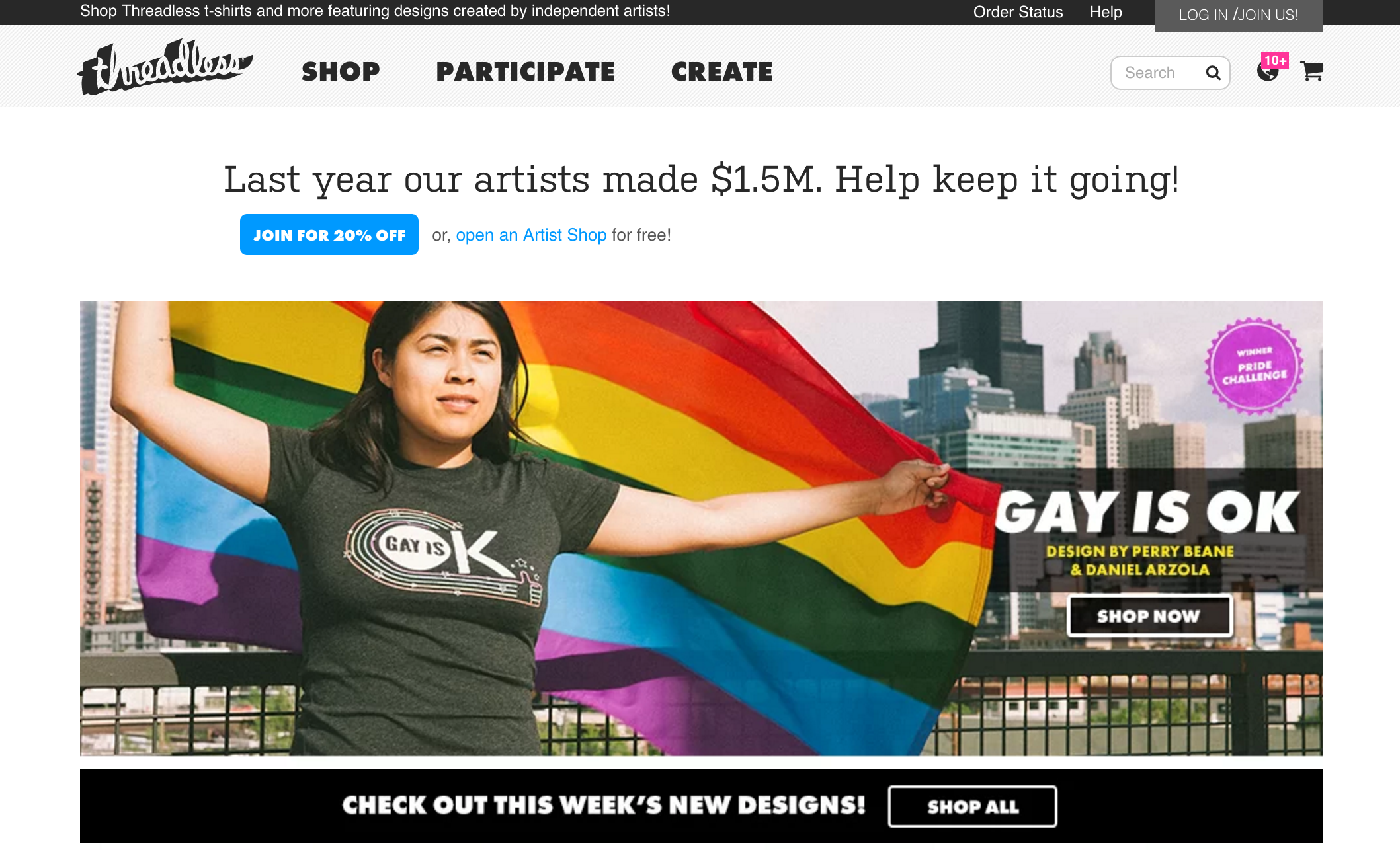
Threadless: This online graphic tee store relies on its customers to design their t-shirts. All designs are crowdsourced by the public via voting. At the very top of their website, there are three main buttons: shop, participate and create.

Since website visitors are on the site to do one of those three things, it makes sense for Threadless to immediately help users narrow down their search options. The main t-shirt categories are displayed in a grid layout. Once users click on one, they are able to endlessly scroll through many designs without having to move to a new page.
Takeaway: Remember to always ask shoppers to do something once they arrive on your website. Don't forget that very important call-to-action. Threadless asks people to do three things: shop, participate, and create. What are you asking people to do when they visit your website?
5. LUSH
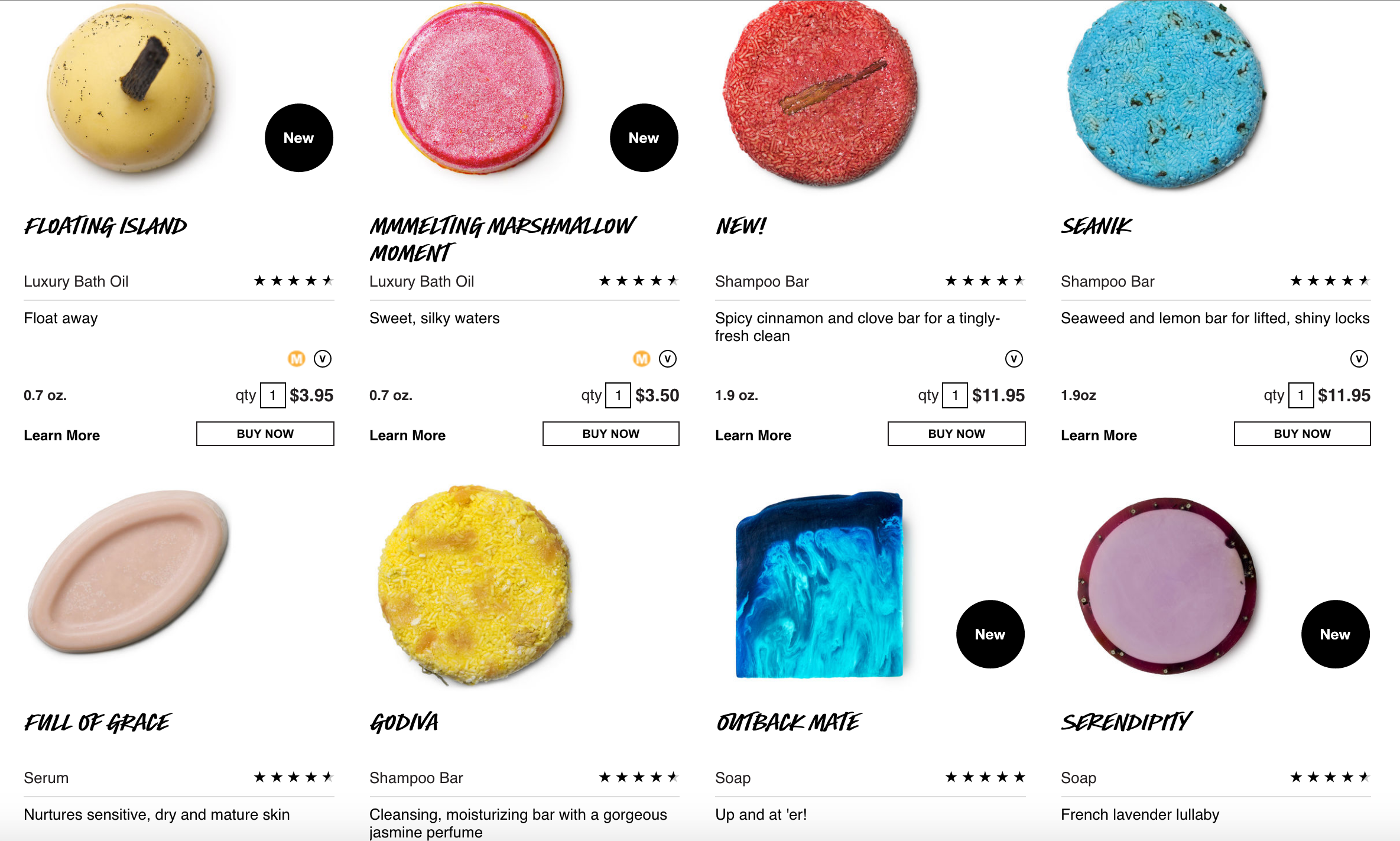
LUSH: This handmade cosmetics brand presents its content in a clean and appealing grid format with large images of its products. Under each item there is a prominent buy button, eliminating the need to open a new page for that specific item.
One click adds your desired item to your shopping cart, allowing you to continue browsing where you left off. One of LUSH’s most notable aspects is its predictive search bar. This becomes especially helpful on smaller devices lacking real keyboards.

Takeaway: Predictive search is a great feature to integrate into an E-commerce website. It helps speed up a user's search process, providing an even better user experience. In addition, predictive search often produces a drop down menu that provides several additional options a shopper has not thought about. This feature can help increase sales.
6. MyDeal Australia
MyDeal Australia: This global online retailer, based in Australia, sells everything from electronics to housewares. The website’s product images are high quality and the fonts are large enough for easy viewing across all devices. The checkout process is simple and easy on all devices and the shipping charges are immediately visible throughout the entire checkout process, not just on the final page.
Takeaway: Don't forget that shoppers use many devices. Often times, one shopper may use multiple devices throughout the day. Your mobile website should be optimized to look and function great across multiple devices. In addition, remember to make sure your font size is large enough for even those who may be a bit visually impaired. Tiny fonts will make shoppers close a website very quickly.
7. Amazon
Amazon: While the popular E-commerce company may not have the most visually appealing design it does prove that even large retailers can make up for lack of design with usability.
Just below the prominent search bar is the option to search by department, which then narrows down the search even more into specific categories. This allows for easy browsing that can boost engagement and keep people on the site longer.
Takeaway: If you have a lot of product and your website seems overwhelming to visitors, you can make your website easy to navigate by allowing shoppers to search by department and category.
Ensure the department links are prominent at the top of page and are very easy to find. Be consistent with your linking structure throughout the website so as not to confue your shoppers.
Conclusion
These seven E-commerce websites have a lot in common. They’re easy to navigate, the content is clear, they take less than three seconds to load, and most importantly they provide a good user experience.
In addition, each website focuses on a simple and clean mobile-friendly design that allows shoppers to quickly and easily find what they are looking for. To find out if your website is mobile-friendly, take Google’s Mobile Friendly Test.
