In an age where information is consumed in mere seconds, we're seeing more and more visuals used to relay facts and figures – whether it be in business, politics or socioeconomics. Data visualizations, like graphs, charts, and tables, are commonplace in the news or business presentations. They can quickly establish trust, tell a story and illustrate complex messaging with little more than a glance. And as the saying goes, numbers don't lie, or do they?
Just like a photo can be altered to remove imperfections, visuals can be manipulated to support the narration an author wants to portray. Likewise, overly complicated visualizations are just as deceptive. Readers should not have to spend more than 30 seconds looking at a visualization to understand the message. Graphs should be easy to interpret, with clear lines and labels. As noted statistician Edward Tufte stated, "Excellence in statistical graphics consists of complex ideas communicated with clarity, precision and efficiency."
Misleading and confusing visuals skew data or ideas and can lead to misinformation guiding important decisions. The overall implications of deceptive data visualizations can have cascading residual effects, leading to repetitive miscommunication and ultimately a lack of trust.
To understand just how easily visualizations can deceive, take a look at the following examples and how they can be corrected:
1. Truncated graphs
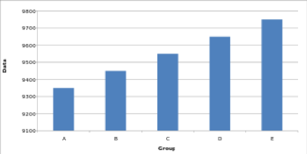
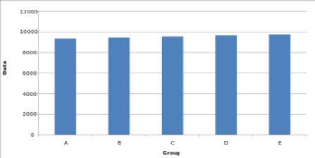
One of the most common manipulations used to control the narrative is by omitting baselines or beginning the y-axis of a graph at an arbitrary number instead of 0, thus creating the impression that there is a significant difference between data points, when in fact, there is relatively little disparity.
To illustrate how a truncated graph can misrepresent the information with just a cursory glance, consider the two graphs below. Both contain identical data; however, the truncated graph appears to show a massive difference from A to E.
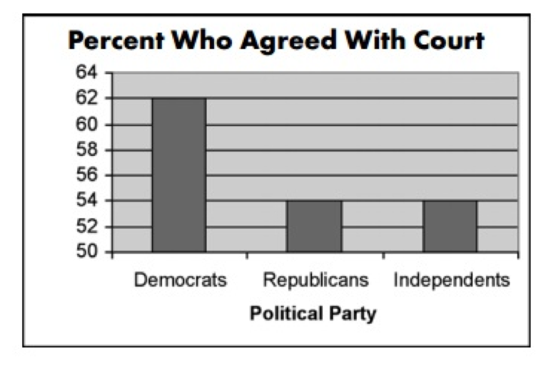
For a real-life perspective, CNN used a similar graph to show political party support for the controversial court decision surrounding the Terry Schiavo right-to-die case in 2005. Here, it appears as though Democrats supported the decision by almost three times more than Republicans and independents, when in actuality, there's only about a 14 percent difference.
A better representation would have been to set the baseline to 0.
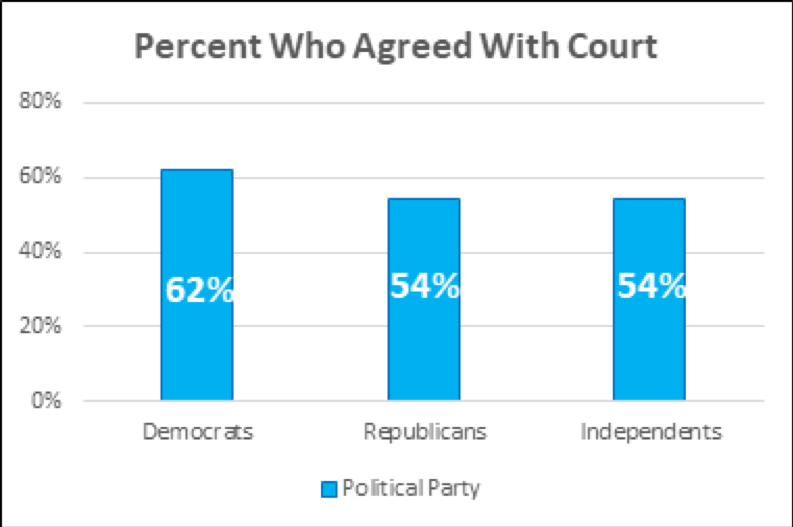
Additionally, clearly placed labels help further tell the complete story and decrease the amount of time it takes to process the information.
2. Exaggerated scaling
Often used to show rates of change over time, line charts are notoriously simple to skew in favor of a chosen narrative. Unlike the bar graphs above, it's not necessary to begin the baseline at 0 to accurately portray the facts. However, exaggerating the scale of a line graph can easily minimize or maximize the change shown. A higher y-axis value will cause a graph to reflect less volatility or growth. Conversely, a lower y-axis maximum will result in a steep line indicating increased volatility or growth.
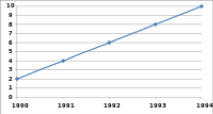
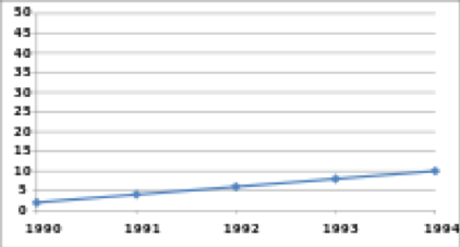
Taking into account the nature of a line graph, which is far more subtle than a bar graph, narrowing in on the y-axis value may help to provide a more precise visualization so that the message can be readily and more accurately understood in seconds.
Consider this representation of global warming over time. In the first image, the y-axis has been blown out causing the graph to indicate relatively no change over time.
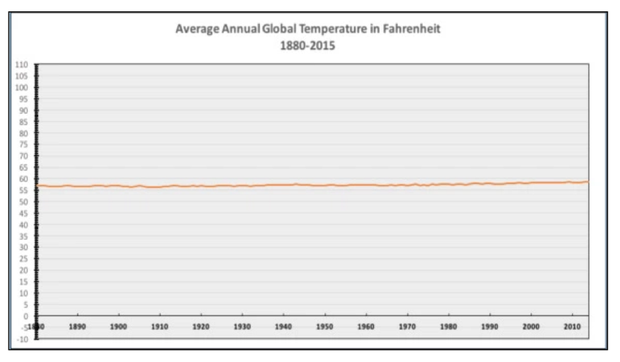
However, if you zoom in, minimizing the scale of the y-axis, you'll see a different, more factual representation.

3. Improper extraction
Commensurate to a white lie, extracting only a portion of data to align with a particular narrative rather than letting the full story speak for itself can drastically alter perception.
Given this data visualization of General Electric Company's performance on the stock market, it appears they're on an upward swing.
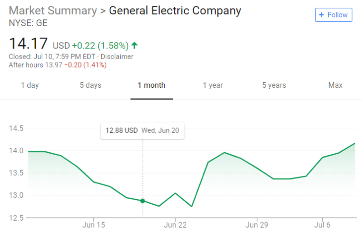
But if you were to pull back and look at the complete picture, it would tell a different story.
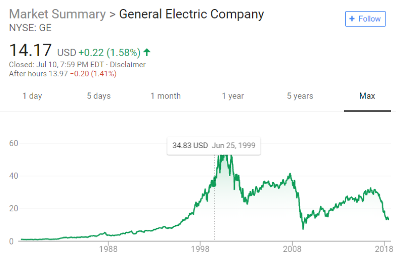
Without providing all the information it's impossible to make an informed decision, but, worse, only providing a snippet of information results in misinformation leading to poor decision-making.
4. Going against the norm
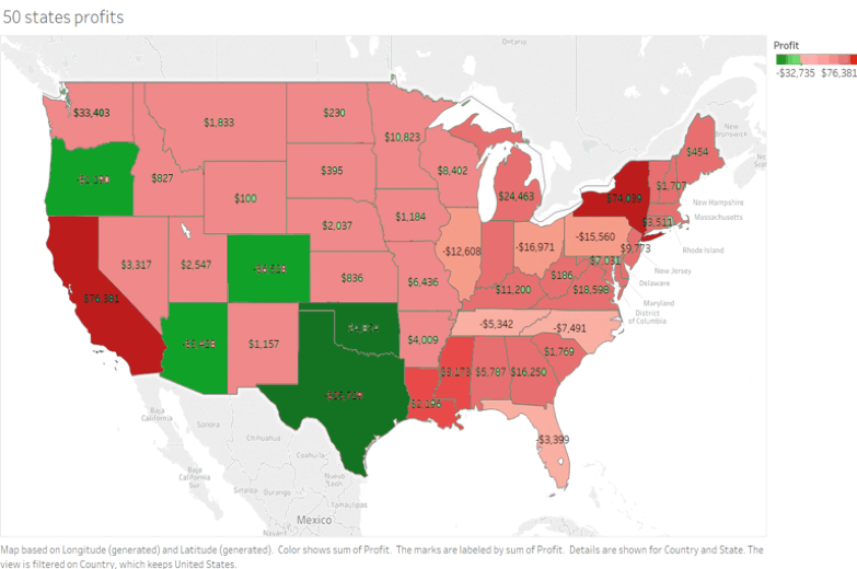
It's common knowledge that when talking finances, green indicates profits and red denotes losses. Deviating from these long-held conventions can create confusion and possible misinterpretation of the facts when taken at a glance.
Here, the original visualization uses standard colors to illustrate profits and losses by state. With a quick look, you can plainly see there are more wins than losses.
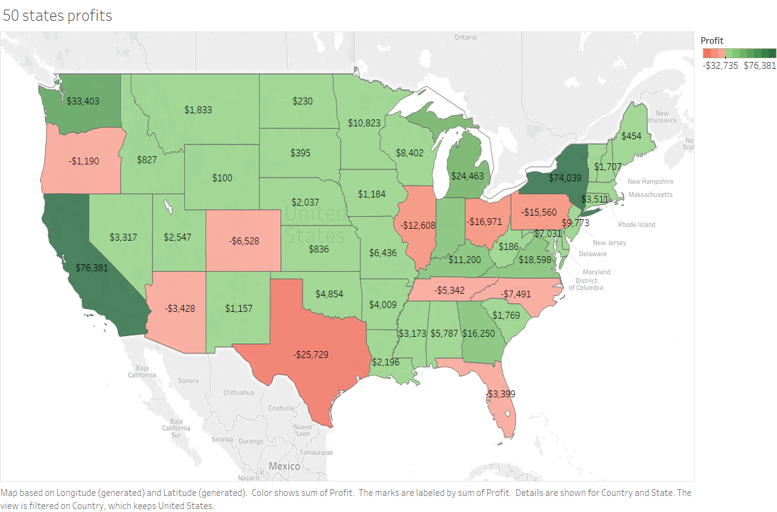
However, simply by switching green for red, it would appear that losses far exceeded profits across the majority of the country.
Likewise, we’re accustomed to viewing numbers increase vertically in a chart, making the following example intentionally misleading.
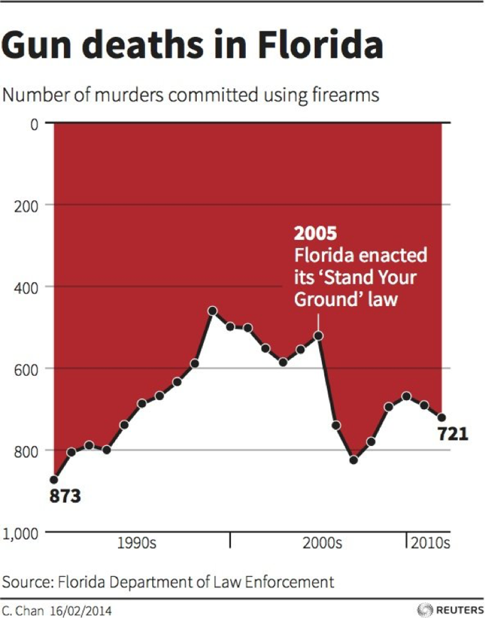
Seeing as the purpose for including data visualizations is to quickly convey information, altering norms like colors or order drastically alters perception as well. To avoid this, stick with convention.
5. Too much pie
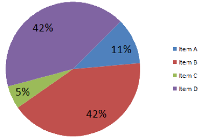
With pie charts, the sum of each slice must add up to the whole. When the numbers don't add up, you know there's an issue – whether it be sloppy mathematics or an intentional misrepresentation.

A pie chart should always add up to 100 percent, so always check your math.
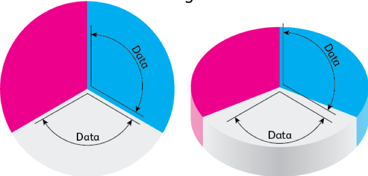
Furthermore, while 3D pie charts may look appealing, they do little to help convey accurate information and, more often than not, can cause a misinterpretation of the data. As Edward Tufte notes in Chartjunk, designers often get caught up in the design element of 3D charts, prioritizing design and technology over the readability of the chart. Returning to the simplicity of a 2D pie chart may be in the best interest of both the reader and the data.

The following example further illustrates the distortion of angles that often occur in 3D pie charts.
Thanks to technology, there is a wealth of data at our disposal. By falsely representing that data, we do a disservice to those that would benefit from its information. Beware misleading visualizations and take care not to complicate the message with overly complex or inaccurate images. As it turns out, the numbers do not lie, but the visualizations representing them may.
