Pop-ups are essential to all successful digital marketing campaigns. When used successfully, they can help increase your customer base and drive engagement, both of which can positively impact your bottom line. By following a few rules of thumb, businesses can use pop-ups to increase conversion rates with ease.
Email pop-up benefits
In a marketing world driven by mobile traffic, pop-ups are more crucial than ever to a marketing campaign's success. Pop-ups are presented to potential customers at a key decision-making moment in their exploration of your company's website. One of the most effective ways to boost growth through online business platforms is through a pop-up marketing strategy. Because customer attention shifts in a matter of seconds, businesses must prove their value quickly.
Pop-ups provide digital marketing campaigns with the power to drastically improve customer retention and conversion rates. Most marketers embed subscription forms at the bottom of webpages, where web users seldom scroll. Pop-up messaging makes subscribing impossible to ignore. Pop-ups also give businesses access to customers' most private and intimate digital platform: their inbox.
This type of online messaging is highly effective at increasing return on investment and adding customers to a company's databases. Pop-ups give sign-up forms an incredible amount of visibility, and their flexibility in design allows you to strategically use pop-ups to secure leads. The segmentation and targeting options available in pop-up development increase visitors' chances to subscribe to the website they are exploring. Numerous templates are already designed to maximize conversion rates and different platforms that help companies program their pop-ups.

What is an email pop-up box?
Before you can take full advantage of the benefits of email pop-ups, it is essential to understand exactly what they are. An email pop-up box is a message that appears to your website visitors while they are browsing online. These messages are automated and triggered to appear on the website screen based on visitors' behaviors. The purpose of a pop-up is to compel the visitor to further engage through explicit calls to action. Pop-ups ask for website visitors' email addresses in exchange for a desirable benefit, such as a discount or exclusive content access.
Best practices for adding an email pop-up to your website
There are important considerations each business must make in the strategic design of its pop-up messages. When creating pop-ups for your website, there are several best practices to consider. Timing, size, visual design, word choice and navigability all contribute to the likelihood that a website visitor will interact with a pop-up. Without proper planning and analysis, the effectiveness of pop-ups can decrease. Below are some best practices for pop-up messaging strategies.
1. Choose the right pop-up genre for your digital marketing strategy.
There are several types of pop-up messages to consider using when your business is developing its digital marketing strategy. If your pop-up is designed to obtain the contact information from a visitor who exhibits value in their relationship with your online presence, a simple email capture form may be all you need. If a customer is about to leave your website without subscribing or making a purchase, or exhibiting intent to exit the site, a pop-up can be triggered to compel the visitor to finalize the purchase or sign up for a subscription before they leave. Other types of pop-ups offer free content, discounts, and entry into giveaways or contests in exchange for an email address.
The two-step opt-in format for pop-ups employs psychology to encourage website visitors to subscribe or sign up by presenting the visitor with a yes or no option. For example, a good pop-up may read, "Do you want the best product ever?" Below the proposition, there will likely be two buttons: one indicating agreement and the other rejecting. One of the buttons might feature text like "Yes, and now!" and the other will reject the offer with words such as "No, I don't want the best product ever." This is an excellent way to prime website visitors for further engagement.
2. Intentionally target your company's website visitors at key moments.
There are two components to targeting website visitors to consider when your business is planning pop-up messages: timing and segmentation.
Timing
It is best to wait at least 10 seconds after a website visitor has opened your company's webpage before offering a message. Then you can create different pop-ups for specific moments in a visitor's experience. Consider timing a pop-up for visitors just entering the site, customers about to leave the site, visitors who navigate to a specific page of your company's website and those scrolling to a certain point on a webpage.
Segmentation
Personalizing pop-ups through segmentation is also vital. Target visitors from specific locations, or a specific source with messaging that aligns l with their beliefs, situational understandings and desires. Your business can also create different email pop-ups for new and returning visitors to increase customer retention and growth.

3. Make a strategic offer based on your service.
There are numerous genres of pop-up messaging, and it is important to choose the type that aligns best with your company's service. The pop-up offer should be incentivizing and tempting, and create a feeling of urgency and special consideration. Depending on the nature of your business and the timing of the pop-up, you may choose to offer the visitor a coupon code, sweepstakes entry, free product or a mystery offer, or promise future benefits. Be mindful of the visitor's perceived barriers to engagement with your business, and use the offer to overcome those anxieties.
4. Choose your words carefully.
The messaging in a pop-up is essential to its success. The first thing a website visitor should read on the pop-up is the benefit they can obtain. Leverage inclusion in an exclusive community by inviting them to join the club. Create a fear of missing out to incentivize the reader to follow the directions on the pop-up. Website visitors may require that your company gains their trust. Many successful marketing campaigns use humor, for instance, to foster a feeling of camaraderie and shared values.
The second element of the pop-up text is the call to action. Consider the primary benefits users will enjoy by signing up for emails from your company, and seek out calls to action that go beyond "submit." For example, a pop-up may ask a reader to click a button that reads "count me in" or "claim my surprise."
In general, choose words that compel the reader to act. The message should always be clear and contain one obvious call to action. Avoid cliches by replacing a phrase such as "order your product" with "get my product." If a visitor is behaving with intent to exit your company's website, a pop-up notifying them of the items they left in their cart paired with a free shipping offer may get that visitor to purchase. Each pop-up should be designed to eliminate different uncertainties that people experience at various points throughout their navigation of e-commerce platforms.
5. Consider website visitors' viewing platforms.
Most people navigate the web via mobile devices, so it is important to consider mobile-friendly designs in pop-up development. Avoid annoying customers by placing them as sidebars or floating bars at the top of your company's website. Google has precise guidelines for pop-up messaging, and if your business wants to avoid an SEO penalty, your pop-up shouldn't prevent your visitors from accessing the page's main content. To ensure compliance, add a trigger to pop-ups that respect Google's guidelines. Pop-ups designed for desktop screens can be much larger, making them harder for visitors to ignore, but these also become more intrusive. It is a best practice only to use full-screen pop-ups when it is triggered by a visitor's intent to exit the website.

6. Make it pop with pictures.
A tremendous amount of communication is interpreted via illustration and image. The visual content of a pop-up matters as much as, if not more than, the text content. A strategically selected image can draw in a viewer's attention, reiterate the benefits of a subscription, and reassure the potential subscriber of safety in sharing their contact information.
Successful pop-ups can:
- Feature photographs of team members to create a sense of human connection.
- Use product images to entice the viewer to make a purchase.
- Convince potential subscribers to take an action, using logos of other subscribing brands as social proof.
7. Be unique and irresistible.
The last thing your company wants is for your pop-ups to resemble those of the competition. Your pop-up colors should coordinate with your website, as well as stand out to catch the website viewer's attention. Consider choosing a vibrant color for a call-to-action button and a passive color for a button allowing a customer to decline your offer. Other marketers add "success" pop-ups to their strategy as well to show new subscribers that they have joined the club. Creating different pop-ups for new and returning users can also increase conversion rates. These practices continue to drive traffic and encourage engagement.
Examples of fantastic email pop-ups
Anthropologie
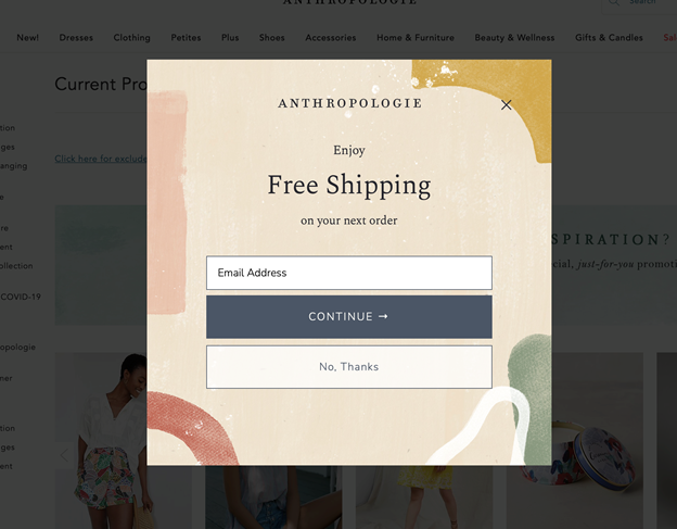
Approximately 10 seconds after the viewer enters Anthropologie's website, a pop-up presents them with the opportunity for free shipping on their next order by providing their email to the company. This encourages the viewer to stay on the website.
The viewer's eyes are immediately drawn to the free shipping text, enticing them to follow the explicit and straightforward direction below. Through a minimalist design, Anthropologie demonstrates the power of strategic colors and concise messaging.
Bed Bath & Beyond
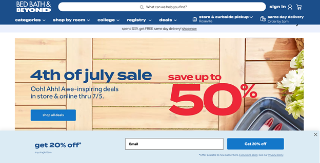
Bed Bath & Beyond presents a pop-up across the bottom of the viewer's screen about 30 seconds after they enter the website. Its position and color do not obstruct the viewer's navigation, and it fits seamlessly with the brand's theme.
"Get 20% off" is both the main text on the pop-up and the words on the subscribe button. Reiterating the deal as the viewer submits their email cements the benefits they are gaining by signing up with the company.
Instacart
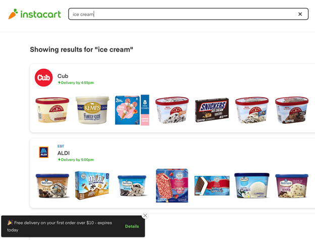
Potential new users on Instacart will be prompted with an unassuming pop-up offering free delivery today only, creating a sense of urgency for the viewer. The pop-up button titled "Details" allows the viewer to explore the option without making an immediate commitment. While this may seem like an ineffective strategy, keeping potential customers on your website is key to increasing sales.
Levi's
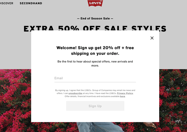
The Levi's website almost immediately presents a pop-up welcoming the viewer to sign up and get 20% off and free shipping on their first order. The messaging dangles the opportunity for exclusive special privileges and offers to anyone who joins the mailing list. Levi's offers both an immediate deal and long-term benefits without using too much text.
Michaels
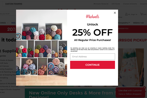
The coupon pop-up on Michaels.com displays its product in a way that is playful and consistent with Michaels' branding. The discount and the button to subscribe are apparent, and the incentive to "unlock" the deal primes the viewer to seek access.
Nike
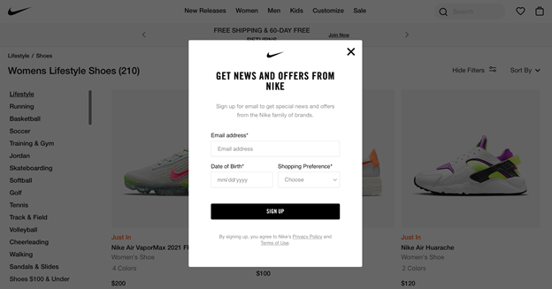
Before you leave Nike's website, the company makes sure you are prompted to join the mailing list. As its logo is well known, it is wise of the brand to place the swoosh at the top of the pop-up. In addition to an email address, Nike asks for the new subscriber's birthdate and clothing preference, giving a personalized touch to the customer experience.
The New York Times
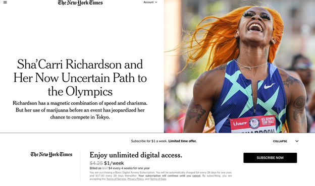
This pop-up on The New York Times' website appeals to potential subscribers with expert wording: "Enjoy unlimited digital access" invites the reader to a good, easy-to-use experience full of potential. Bolding "limited time offer" next to "subscribe for $1 a week" creates irresistible conditions for a customer.
