At this point, all of us have had at least some experience shopping online. Chances are, we've also all experienced an e-commerce site that had a pretty terrible experience—one that might have even led you to abandon the effort all together and go elsewhere.
This is the experience you want to avoid at all costs, and is why design is such a vital part to success in e-commerce. An e-commerce site that is easy to use ensures that consumers can find the products they want and need, and purchase them. Sounds simple, but in reality, it's a challenge for all e-tailers.
How can you ensure an e-commerce site design that optimizes user experience with easy usability? These guidelines help you navigate the design process for increased e-commerce success.
Keep it simple
When it comes to designing an e-commerce site, less is more. The simpler your design is, the better the user experience. How can you streamline and simplify the design of your e-commerce site? Consider the following tips:
- Minimize the number of clicks for users to reach the info they want. A user shouldn’t have to dig through endless web pages in order to find information about the specific product they are interested in. Make sure web content is categorized in coherent organization hierarchies so products can be easily found.
- Label forms, links, and products clearly. You should never leave a user guessing about the purpose of a piece of web content. Always label all forms, links, and products clearly to facilitate easy navigation.
- Use universal symbols (such as left-arrow for the back button, finger clicking on links that you want users to click on). To make navigation more intuitive, make sure that you are using widely recognized and familiar symbols. Now is no time to reinvent the wheel!
- Always provide a search function on site. A search function is absolutely critical, ensuring that users can find the information they are looking for without navigating endlessly.
- Offer filtered navigation. Filtered navigation allows customers to narrow search results by eliminating products that they find to be irrelevant. It makes searching easier, ensuring that users can actually find what they are looking for.
- Make use of reviews as a navigational aid. Allow users to sort products based on reviews, ensuring they can easily find the highest rated products.
Write readable content
According to Lori Soard, blogger at WHSR:
If you use big words on your site, your visitor may need a dictionary to understand what you’re talking about. This is frustrating and in the online world, where people want immediate information, the chances of a reader taking the time to go look up an unfamiliar word is fairly slim. Instead, you’ll simply lose a reader.
So in short, make sure you are writing clear, coherent, and compelling content that both captures your users’ attention and can be easily understood. Try this simple tool (Readability Score) to check your content’s readability.
Develop a linear checkout process
The checkout process should be linear, meaning that the user should always have the option of either “previous” or “next.”
Every time a customer completes a phase of this linear checkout process, he or she should move onto a new page. This mitigates user confusion and enhances overall user experience.
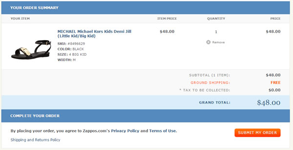 Checkout process at Zappos is clear and direct
Use clear error indications at checkout
Users are less likely to resolve the errors when they have overlooked the error messages. Therefore, it is a wise idea to ensure that all error messages are prominently displayed. Use bold text or text that has been highlighted in red or yellow in order to draw users’ attention to the errors.
Make sure that your site loads quickly
When it comes to e-commerce websites, site load time is critical.
Did you know that a staggering 25% of web users will abandon a web page that takes more than four seconds to load? Or that an increase of one second in page load time can actually cut conversion rates by seven percent?
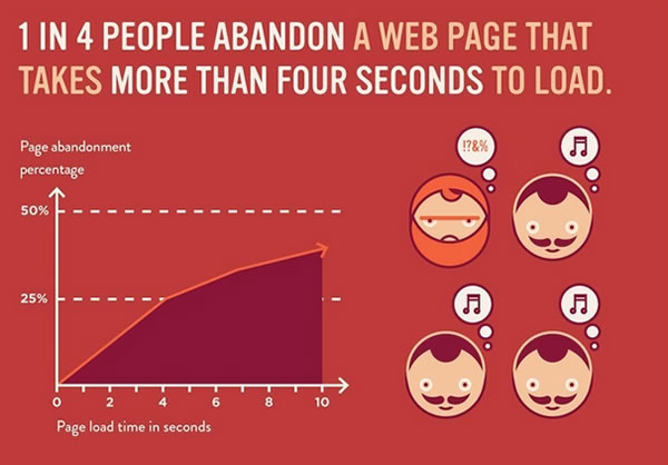 Infographic via Mashable
Website bounce rates (the proportion of users who enter a website and then immediately leave) increase by 100% when load times are over 4 seconds and by 150% when load times are over 8 seconds.
The bottom line is that the faster your site loads, the higher key metrics are, like time on page and conversion rates. Make sure that your site loads as quickly as possible in order to maximize sales and revenue.
Use auto-complete in site search whenever it’s possible
Auto-complete, as the name suggests, automatically offers suggestions for partial search terms upon user entry.
Auto-complete is advantageous as it can help to lead users toward new products similar to the ones they are looking at and also ensures users can find products even if they only know a part of the product name.
Use “breadcrumbs” to facilitate easy site navigation
Breadcrumbs clearly illustrate to a user his or her position in relation to the overall site, facilitating easy navigation. Breadcrumbs can be broken down into four different categories: location, attribute, path, and title. They ensure that a user can easily return to previous pages or progress on to new content, essentially laying out a kind of navigational path.
Make sure that there is a search bar on every page of your site
Users need to be able to find the products they are looking for on your site in order to purchase them.
What is the easiest way to ensure that users can find what they are looking for? A search tool. Make sure there is a prominently displayed, easy-to-find search bar on every single page of your website.
Consider this: When American Bridal instituted a floating search bar on each of its website’s pages, revenue per visit jumped by 34% while average order volume increase by 24%.
Make your website mobile friendly
In today’s world, mobile web design is key, especially when it comes to e-commerce sites.
Did you know that research shows that 80% of mobile device users now shop using their device? All in all, more than $40 billion worth of purchases are made each and every year with mobile devices, and that number will only continue to rise.
The bottom line is that mobile users tend to be action-oriented users, meaning that the specific intent of their website use is to take action by following up with a company for more information, visiting a store, making a purchase, etc.
Consider the following: Google researchers actually found that 3 out of 4 mobile website searches triggered customer action, and 17% of these actions were purchases. A mobile-friendly website will allow you to fully leverage the power of mobile traffic, boosting conversion rates, increasing sales, and improving your bottom line.