You visit two different websites in the same industry.
One of those websites offers you three options, the other presents 15 different choices.
Out of the two, which website do you think will perform the best?
Naturally, we’d be inclined to think that people love having the power of choice - and they do.
They are attracted to - and can become addicted to the possibilities of choice—because they intuitively feel they’ll find something that best satisfies their needs.
But while this might be how individuals feel, the psychology of choice proves that “the more options we have, the less likely we are to make a decision at all.”
Having too many choices often leads to overwhelm and inaction—otherwise known as choice paralysis.
So as business owners, how can we leverage this psychology to our own advantage?
The Psychology of Choice
The concept of "psychology of choice" was coined in 2000 by psychologists Sheena Iyengar and Mark Lepper, made popular by a study evaluating consumer choices.
In their experiment, Iyengar and Lepper presented shoppers with 24 varieties of jam, giving them a taste test and a $1 coupon off any jar of jam.
In a separate test, they gave shoppers six varieties of jam, offering taste tests, but no coupons.
Surprisingly, shoppers visiting the large display were one-tenth as likely to make a purchase.
Since Iyengar and Lepper’s landmark study, ample research has followed proving that, when it comes to consumer choice, the results are the opposite of what we’d naturally expect.
If there are too many options:
- Customers fear making the wrong choice
- The decision becomes more complicated
- It triggers the urge to find additional options
When it comes down to it, consumers faced with too many choices are more likely to walk away than to select an option.
10 Ways Your Startup Can Leverage the Psychology of Choice
Certainly, you’ll want to offer your customers the choices they’ll respond best to—no matter how many options that requires.
Fortunately, there are ways we can use this psychology to our advantage.
1. Eliminate Unnecessary Choices
Evaluate your product and service offerings and ask what needs to get the cut.
How can you streamline the choices you currently offer to make the user experience more laser focused and generate more sales?
As an example, consider Bishuli, an Italian recipe blog that reduced its options on two different pages, producing an increased clickthrough from 2.7 to 12.3 percent and 3.6 to 11.5 percent.
2. Create Clear Categories
If you have an E-commerce store or lots of products and services and can’t eliminate choices, then create clearer categories.
According to research, we can handle more categories than choices because it helps us easily narrow down our options. Spencer Lanoue, writing for UserTesting, suggests “instead of giving people 24 options, give them a choice of 6 categories, and then another choice of 4 options.”
3. Don’t Present More Than Five Options at Any One Time
As suggested above, try to narrow down the choices to five at a time, as research shows that’s the optimal amount the brain can handle at any one time.
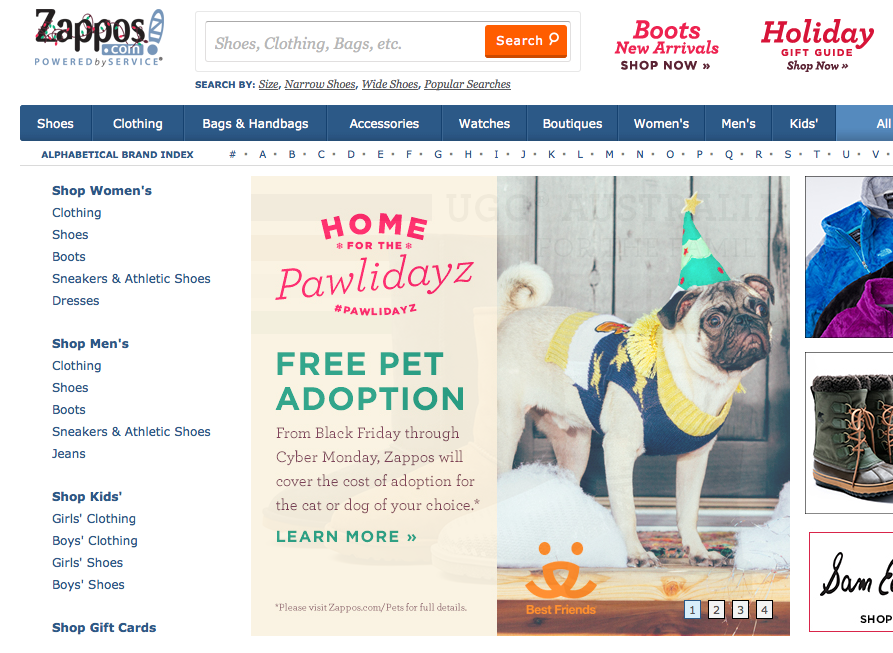
Putting principles #2 and #3 into action, you’ll notice that, on the left of Zappos website, they present clear categories and only offer five options in each.

4. Provide a ‘Default’ or ‘Suggested’ Option
It’s your job to focus the customer and help them make the best purchase decision. Don’t do this through being pushy, but rather by being suggestive.
5. Provide Social Comparisons
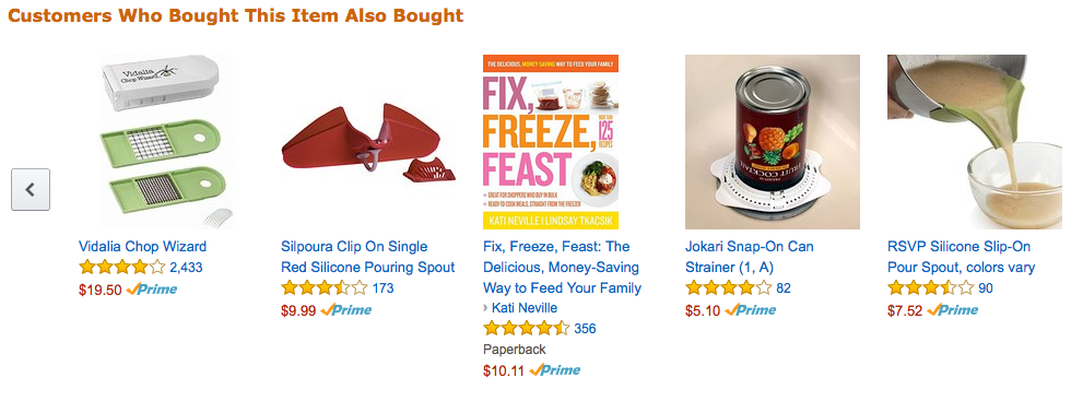
Amazon does this well by showing related products that people like or buy:

Although Amazon has thousands of products, they provide filtering options like this to help consumers narrow down their choices.
6. Simplify Your Website
Add only what you need to your site navigation to simplify your site.
Instead of offering everything from one page, think about the one or two goals you want to achieve from each page and focus on achieving them.
Think about Google, when you go to search you only find one thing on the landing page, a search bar. It’s a simple, straight-forward way for the engine to drive users towards its desired action.
7. Provide Three Pricing Options
While you don’t want to flood viewers with options, giving them a few options still appeals to the consumer's desire for choice possibilities.
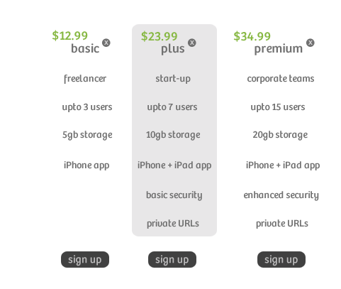
It’s also been shown that, when offered three options, people will usually choose the middle package, making the following a great way to create an instant comparison:

Instead of comparing your product or service to another product or service, consumers compare the three pricing packages, increasing the odds that they’ll eventually purchase from you.
8. Choose Specific Times to Send Correspondence
If you’re sending out promotional offers, send them early in the day.
People have to make a combination of simple and complex decisions throughout the course of the day, so they have less mental power and energy to make decisions toward the end of the day.
Make sure your message hits them when they’re most receptive to making the choice to work with your company.
9. Present Just One Offer in Emails
Time and time again, expert marketers have emphasized the importance of making just one offer in email communications.
When we think about the psychology of choice, it’s easy to understand why - emphasizing one product, service or offer helps the buyer make a decision, rather than get caught up deciding between too many options.
10. Less is More
Want a quick way to increase your conversion rates? Make the choices easier.
Keep things simple and remember that less is more.
Focus on how you can reach more of the same customers. Focus on how you can better cater to your chosen target market and, by doing so, increase the authority and perceived value of your products or services.
As Liraz Margalit, PhD, puts it simply:
“Choices can become overwhelming so make it easy for customers.”
We can’t expect customers to do the work. Instead, use these tips to help customers overcome their fears and leverage the power of psychology to encourage them to make a firm buying decision.
How do you control the way choice is used on your website?
